UI impacts behavior
“It is not impermanence that makes us suffer. What makes us suffer is wanting things to be permanent when they are not.” — Thich Nhat Hanh
Snapchat was different. While the UI is now commonplace — in Instagram stories, Twitter fleets, and YouTube shorts — Snapchat’s initial focus on ephemeral posts, with photos that quietly vanished after a day, helped Snapchat differentiate itself from other social networks.
Snapchat founder Evan Siegel was interviewed by Kara Swisher at Recode in 2018. Evan talked about designing for small groups of friends, removing the worry about sharing with a large group where it’s more difficult to be yourself:
When we looked at social media, one of the biggest problems that really stood out to us was this constant conflict between needing to have a small group of friends to feel comfortable expressing yourself, but also needing to have a large group of friends so that you can watch more content.
Some people have experimented with bringing a Snapchat-inspired ephemeral UI to blogs, with short videos that go away. In 2017, Aaron Parecki added stories to his home page, indicated with a circle around his profile photo, similar to the UI from Instagram Stories.
But the foundation of blogs is as a record of the author’s writing, of ownership, of remembering both the important and the mundane. The audience of a blog isn’t pinned down with specific follower counts. It could be a few friends or family, or could be anyone coming in from a Google search result. Micro.blog and blog-like platforms are unlikely to have ephemeral posts without carving out entire new sections of their UI, reserved just for a different type of content.
We’ve seen how UI design choices can encourage or discourage certain types of posts multiple times in the history of Twitter. When users on Twitter started including hashtags in their tweets, the team at Twitter thought it would be useful to link those to a search. That way, any hashtags would link to all recent tweets using that hashtag. It was a new, ad-hoc way to group related tweets together.
The hashtag as we know it today was first suggested by Chris Messina. Before Twitter supported it as a built-in feature, Chris wrote about using Twitter’s “track” feature to get notified when keywords were used:
Hashtags become even more useful in a time of crisis or emergency as groups can rally around a common term to facilitate tracking, as demonstrated today with the San Diego fires (in fact, it was similar situations around Bay Area earthquakes that lead me to propose hashtags in the first place, as I’d seen people Twittering about earthquakes and felt that we needed a better way to coordinate via Twitter).
But hashtags and full-text search can also be gamed. Hashtags have been so overused on Instagram that Instagram put a cap on the number of hashtags that could be used when posting a photo, leading to the common practice of adding extra hashtags as the first comment on a post.
Worse, people will piggyback on trending hashtags to insert their own tweets into conversations between people they aren’t following. They will attack strangers who post about the same topic, especially if it’s divisive like politics.
When first blogging about hashtags, Chris recognized this potential to discover and join another conversation, but in the early days of Twitter viewed it only as a positive thing:
Every time someone uses a channel tag to mark a status, not only do we know something specific about that status, but others can eavesdrop on the context of it and then join in the channel and contribute as well.
As platforms like Twitter and Instagram have grown, the behavior around hashtag search had to be modified. There are just too many posts. Both platforms use an algorithm to determine what tweets and photos to show for a hashtag search.
An algorithm might not have intentional bias, but any filtering has an impact on what we see. In 2020, BuzzFeed News covered a bug in Instagram’s hashtag search that included some posts incorrectly, effectively favoring pro-Trump posts in a search for the hashtag #JoeBiden:
Searches for Biden also return a variety of pro-Trump messages, while searches for Trump-related topics only returned the specific hashtags, like #MAGA or #Trump — which means searches for Biden-related hashtags also return counter-messaging, while those for Trump do not.
For Micro.blog, I didn’t want to start out supporting hashtags. By not linking hashtags in a post on Micro.blog, users will find less value in them and slowly stop using them. As a side effect, posts are much cleaner without hashtags, so the timeline feels less cluttered.
Mastodon posts are by contrast often overloaded with hashtags, even more so than on Twitter, further hurting readability. Some of that user behavior to overuse hashtags comes from how search in Mastodon works. Search in Mastodon only indexes hashtags. If you don’t use hashtags, your post cannot be found via search.
The UI for hashtags impacts how users behave. It encourages using certain features, and discourages others. It shapes what people include in their tweets and how they format it.
Communities are also shaped by the tools members are given. Longer posts might lead to more thoughtful replies. Heated debates might be tempered if the UI encouraged hitting “pause” on conversations before they escalated into personal attacks.
In 2014, Benjamin Grosser wrote a paper about metrics in social networks and how they affect social interaction. He documented where metrics are used, from Facebook’s friend counter to all the little totals of likes and pending messages that cover the News Feed:
Likes given demonstrate our taste and culture to others, while likes received suggest that our statements and collections are worthy of recognition. When this need for esteem intersects with the desire for more, the accumulation of social and symbolic capital becomes the primary objective of the metricated social self.
Some of these metrics feed into Facebook’s ad platform. Some metrics measure our engagement and invite us to keep clicking: new friends, more likes, fewer unread messages. This behavior is baked into the UI that Facebook designed.
Even blogging platforms that might seem to have the opposite intentions of Facebook still were designed to encourage certain behavior. As we covered in Part 2 with alternative blogging platforms, Ghost needs you to put a title on all your posts, making it unsuitable for microblogging. Whenever you create a post without a title, Ghost reverts it to the placeholder text “(untitled)”, which shows up on the published blog:
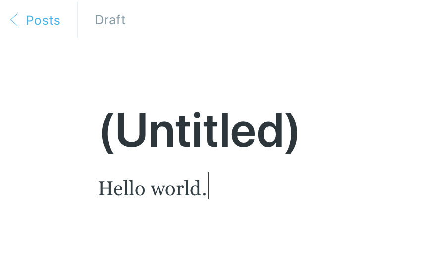
Ghost is actively getting in your way. Not only was it not designed for title-less posts, there is special code in the app to discourage it. A well-meaning feature (“don’t let the user accidentally leave a blog post untitled”) turns from a user experience improvement to a detriment.
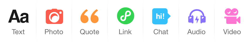
Contrast with Tumblr’s UI, which wants you to create short posts without a title. To get started, you see these buttons:
It encouraged people to be thoughtful about what kinds of posts they were creating, and to see those as distinct portions of a web page. This puts the focus on the content and not on layout and design issues.
Mac developers have a long history of building apps with opinionated, thoughtful designs. This inspiration comes from Apple, where some of the limitations even in the first Mac were offset by beautiful attention to detail in other areas. There were no arrow keys on the first keyboard, even though it was standard on PCs, to encourage users to use the mouse to move the insertion cursor or select text.
So we look for ways to make the user experience familiar and approachable. In 2004 as Brent Simmons was working on MarsEdit, he wrote about making blogging more like email, which people were familiar with:
The idea behind MarsEdit is this: the value of having an email-like user interface is not just that it’s easy-to-learn—it’s that it helps people get into a more email-like frame of mind, where they’re more likely to be relaxed, less pressured to Write Something Good.
Software can be opinionated — designed to encourage a specific way of working with data — without being inflexible. It doesn’t need to hold the user back to point them in the right direction.
Photographers have long loved the format of square photos, or nearly square, like the 4x5 aspect ratio that was used for most of Ansel Adams’s famous photos at Yosemite. Writing about his 1940 photo Clearing Winter Storm in the book Examples: The Making of 40 Photographs, Adams also touched on the process of using filters for the shot, and further tweaks with dodging and burning in finally developing the negative:
I think of the negative as the “score,” and the print as a “performance” of that score, which conveys the emotional and aesthetic ideas of the photographer at the time of making the exposure.
The process of making a photo in the 1940s was tedious by today’s standards. Adams would visualize the image, testing the framing in his mind, or use a black and white Polaroid to capture what it would look like before he was ready for the final image.
Working today, photographer Adrian Vila’s photos are in part a throwback to that earlier time. He shoots in black and white, looking for contrast as he captures a rainy day alone off the coast of Spain, or the fog at sunrise over San Francisco, or other landscapes that become timeless stills to suggest a quiet pace.
In a video about composition, Adrian talked about the appeal of square photos:
The square format was been with us for a long time. What I like about it — and this just my opinion — is that it creates more balanced images than other aspect ratios. It invokes calm. … It is very good for minimalistic images, and it favors centered subjects, so it gives it more importance in the frame.
Defaulting to square photos enforces that composition right away. It removes the friction of choosing how to frame your photo, making it easier for users and more likely that most photos will fit well in both a timeline or grid.
Adrian would follow up in more detail about square photos in 2022:
Placing the subject in the center is the most natural way to compose. This works especially well with clean images when there are not too many distracting elements around the subject. As we said earlier, the eye tends to move in a circle around the frame, so the cleaner the image the better. […] I believe it makes for very peaceful, still, serene, and calm images.
…
In 2005, Instagram founder Kevin Systrom took a photography class in Florence, Italy. His teacher gave him an old Holga camera, which took only black and white, square photos. Setting aside a modern digital camera and using the Holga was about learning to work with constraints.
Sarah Frier recounted the story in her book No Filter:
Systrom spent the winter of his junior year, in 2005, snapping photos here and there in cafes, trying to appreciate a blurry, out-of-focus beauty. The idea—of a square photo transformed into art through editing—stuck in the back of Systrom’s mind. More important was the lesson that just because something is more technically complex doesn’t mean it’s better.
Years later the square photo default would make it into Instagram. Making this format the default was a particularly good fit for a mobile platform.
In a timeline like Instagram or Micro.blog, square photos don’t push the first caption off the screen like a portrait photo. And when a landscape photo is cropped square, it’s effectively zoomed in to cover the same width, so the subjects of the photo are larger. You can fit more photos on a mobile screen with fewer compromises.

So we have all of these photo features and filters in Micro.blog. Why? By building these photo features in, the software is sending a message. It’s inviting the user to take photos seriously. It’s inviting the user to experiment, to tap around and share a photo, since the feature isn’t buried in the app or left to an external app.
We care so much about photos that we build a companion app just for photos called Sunlit. The discover screen also sends a message. It says: “if you put a little thought into your photo, something that looks kind of interesting, your photo will go here too.” Everyone can find it and follow you.
We are over a decade after Mark Zuckerberg’s infamous “move fast and break things”. It is time for developers to slow down. We can’t predict exactly how users will use the tools we build, but we must be more thoughtful about it, asking the right questions, and ready to pivot if a feature doesn’t end up being a force for good.
For a specific platform, does this feature encourage the kind of community we want to see? For the web, does this feature support openness in other systems?
Even Facebook is realizing this. Helle Thorning-Schmidt, former prime minister of Denmark and co-chair of Facebook’s new Oversight Board, said to Casey that “Facebook was always criticized for moving fast and breaking things,” when asked about how the Oversight Board will hear appeals from people whose content has been removed from the service:
I think we are looking at the opposite — we want to look at quality, and look at how we are here for the long term, rather than to move quickly and be under a lot of time pressure.
The web would not be the same if it was just text. It would not be the same if it was just photos, or just links. Hypertext allows us to combine all of these things into one web. Platforms that build on HTML will add to the web instead of trying to replace it — instead of standing as a silo apart from it.
Next: Using HTML →