Sunlit and photo feeds
“To the complaint, ‘There are no people in these photographs,’ I respond, There are always two people: the photographer and the viewer.” — Ansel Adams

One afternoon before the Çingleton conference in 2012, Jonathan Hays and I were taking photos around Montreal. There was a feeling at the time that group photo sharing in particular should be much better. As everyone in a group snapped pictures of their surroundings — of people, events, food, anything — that years later, you should be able to go back to that time, to see the best photos collected together.
At the time there was no easy way to put those photos together, including text for why the photos were significant. I liked the idea of building a new app around photos, with the same themes of curation and preserving past events that were so important to some of my previous apps.
So we let the idea sit in the back of our minds, and later we wrote a little code as time allowed. At the App.net hackathon before WWDC 2013 we dove into the project in earnest, figuring out how it would sync, then over the summer took some more time to think through the user experience.
Sharing a single photo has been done a hundred times on iOS. Instagram was an important app to nail the timeline UI. There were other attempts to bring the simplicity of Instagram to other platforms: Favd for App.net, and Pressgram for blogs. But hardly anyone had attempted to tackle photo curation, group sharing, and publishing. Sunlit 1.0 was our first pass at this and we were excited to try solving a new problem with photos.
They say you should spend money on experiences — on memories, not things. Sunlit helped put those memories together, share them as a group, and rediscover them when it matters.
That vision evolved over the years. When App.net faded away, Jon and I rebuilt Sunlit around blogs. In subsequent versions it moved closer to the Instagram UI with a timeline of photos from friends, but powered by blogs.


Sunlit is separate from the official Micro.blog app because that separation lets it have a UI that makes sense for longer blog posts with multiple photos. If all of the functionality of Sunlit were added to Micro.blog, it would make the default Micro.blog photo posting experience much less approachable for new users.
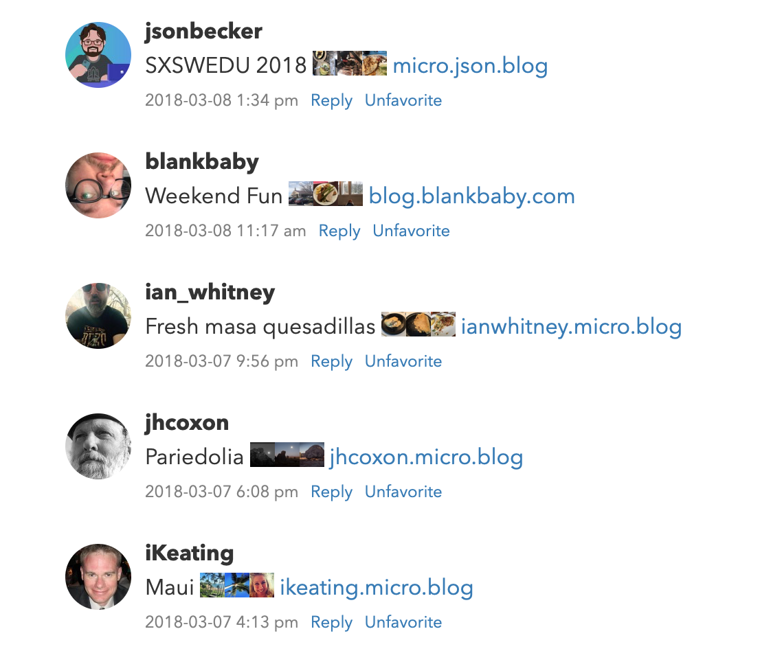
When you a post a longer story with a title and multiple photos using Sunlit, it creates a full blog post, not a microblog post. Because the post has a title, Micro.blog uses that title in the timeline and links back to your post. It also attempts to include a few tiny photo thumbnails in the timeline to give a preview of the post:

Sunlit uses Micropub to publish its blog posts. For these longer blog posts with multiple sections and photos, instead of passing an array of photo URLs in Micropub’s photo parameter, Sunlit formats its own HTML for the full post with inline image links and sends that to Micro.blog:
<p>The next day we did a bike tour of the city...</p>

<p>
  <a href="photo1..."><img src="..." style="display: inline-block; max-height: 200px; width: auto; padding: 1px;"></a>
  <a href="photo2..."><img src="..." style="display: inline-block; max-height: 200px; width: auto; padding: 1px;"></a>
</p>

<p>Murals, CN Tower, trains at Roundhouse Park, sculptures at Ireland Park...</p>

<p><a href="photo3..."><img src="..." style="display: inline-block; max-height: 200px; width: auto; padding: 1px;"></a>
This is why using HTML as the foundation for microblogging can be so powerful. Apps are not limited to only the post formats a server platform has designed. There would be no way to create a post like this on Instagram, Threads, or even Mastodon.
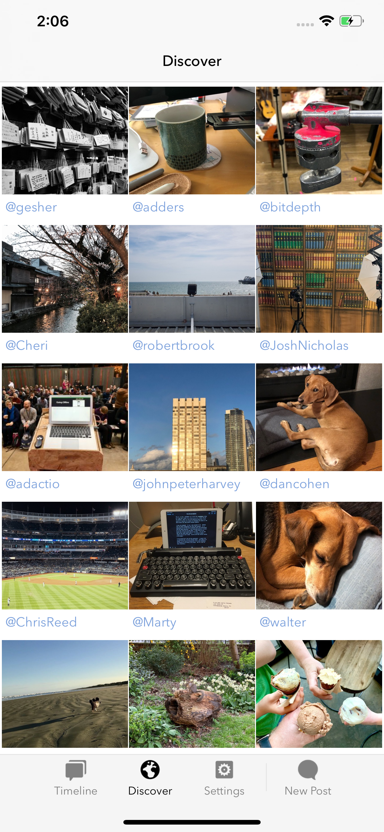
Sunlit is powered by feeds. Micro.blog provides several feeds specifically for photos:
micro.blog/posts/photos: The Micro.blog timeline you would usually see, but only photo posts.micro.blog/posts/media: Your timeline with both photos and videos.micro.blog/posts/discover/photos: A curated selection of photos across all users on Micro.blog.yoursite.com/photos/index.json: A list of blog posts that have included a photo, on a specific Micro.blog-hosted blog.micro.blog/posts/your-username/photos: The requested user’s photos across any of their blogs.
The last feed includes two fields that aren’t in other feeds in Micro.blog:
- The main image in the blog post, in JSON Feed’s standard
imagefield. - A smaller thumbnail version of the photo, in a Micro.blog extension under
_microblog→thumbnail_url.
Here’s a portion of the JSON for that special feed:
{
  "id": "7754651",
  "content_html": "...",
  "url": "https://www.manton.org/2020/01/13/i-put-this.html",
  "date_published": "2020-01-13T18:01:13+00:00",
  "image": "https://www.manton.org/uploads/2020/1be7fcd16d.jpg",
  "_microblog": {
    "thumbnail_url": "https://micro.blog/photos/400/https://www.manton.org/uploads/2020/1be7fcd16d.jpg"
  }
}
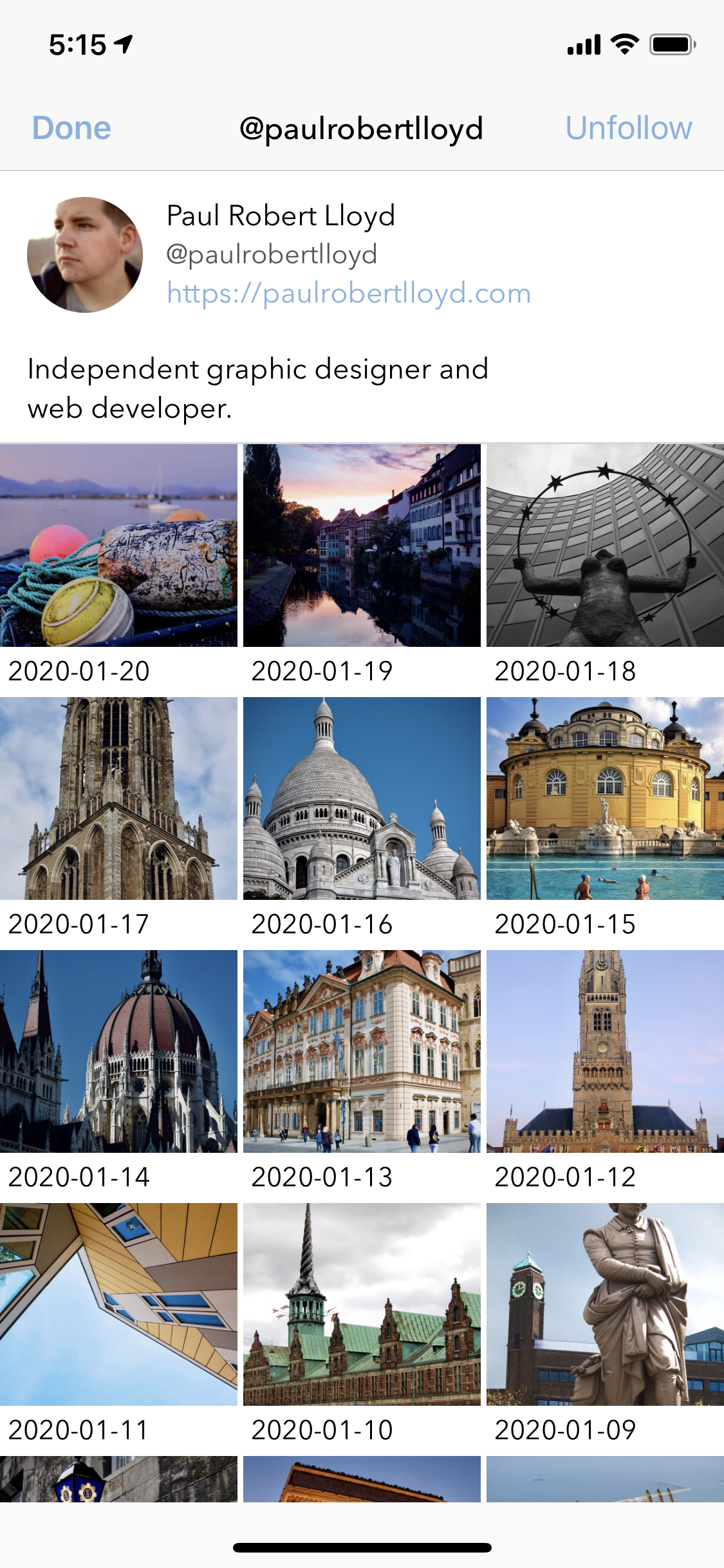
These extra links in the first photo in a blog post makes it easier to build apps that show an overview of a user’s photos without requiring the app to parse the HTML in all of the blog posts. For example, we use this in Sunlit’s user profile screen:

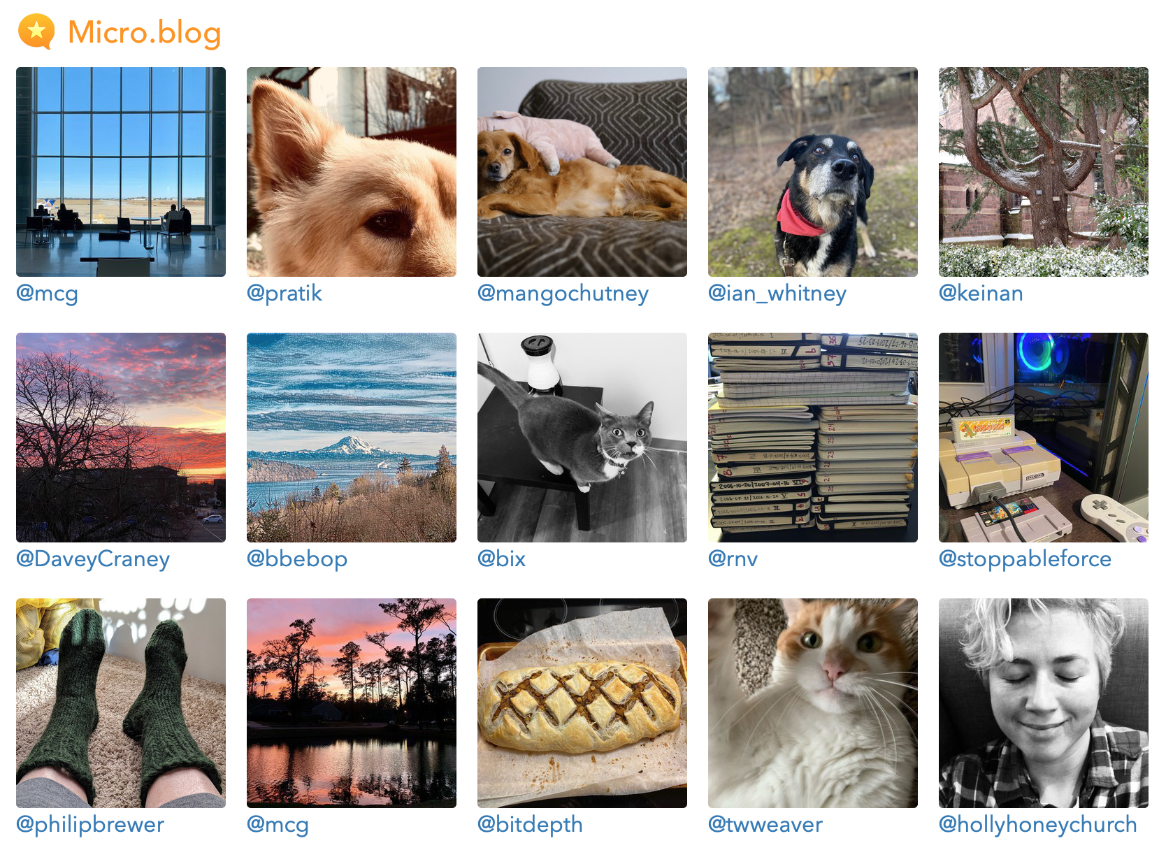
There is also a special photos page for Discover on the web, featuring a grid of photos. You access it from the “More Photos” button on Discover → Photos:

All of these are backed by the same underlying data and feeds.

Jonathan LaCour built a JavaScript-based photo grid for blogs called Microgram, relying on the fact that all Micro.blog-hosted blogs have a JSON Feed of photos. The script downloads the /photos/index.json feed, then dynamically adds HTML for photo thumbnails and links to the current page.
Seeing Jonathan’s script was a great reminder of why Micro.blog has so many feeds. Our blogs and platforms should be as extensible as possible, allowing mashups of different APIs to build new tools.
I loved the Microgram photos, but I also wanted it to be a built-in Micro.blog feature. All blogs should be able to have a beautiful photos page by default.
The new built-in photos page looks similar to Jonathan’s Microgram:

Because it comes from a template in your blog’s theme, you can style or customize it. The HTML uses CSS Grid to lay out the photo thumbnails:
<div class="photos-grid-container" style="display: grid; grid-column-gap: 15px; grid-row-gap: 15px; grid-template-columns: 33% 33% 33%;">
  <a href="https://www.manton.org/2020/01/13/i-put-this.html">
<img src="..." width="300" height="300" style="border-radius: 5px; max-width: 100%; height: auto;" class="photos-grid-item" />
  </a>
  <a href="https://www.manton.org/2020/01/11/found-a-bird.html">
<img src="..." width="300" height="300" style="border-radius: 5px; max-width: 100%; height: auto;" class="photos-grid-item" />
  </a>
</div>
The CSS is included inline so that none of the built-in themes need custom CSS for the photos page to work. You can override the CSS Grid spacing and number of columns in your own custom CSS file.
If you need more control over the design, you can create a new theme for your blog and edit the template layouts/_default/list.photoshtml.html. This is a Hugo template that loops through the .Params.photos variable set by Micro.blog, which is a list of all the JPEGs on your blog. (There is a separate variable, .Params.images, that includes all JPEGs and PNGs, so screenshots and other images are also included.)